Google Meet
Making meetings more bearable with a new greenroom feature
ABOUT PROJECT
I embarked on this project to enhance collaboration and efficiency within Google Meet's Greenroom, driven by a desire to create a more seamless and productive meeting experience for users.
View Prototype

BACKGROUND
PROBLEM #1

PROBLEM #2
feel meetings have no purpose
feel dependent on technology to collaborate
feel meetings are too long
UNDERSTANDING THE PROBLEM
I use Google Meet often, but I'm not every user. I would need to first understand the problem more in-depth before I could make a solution.
COMPETITIVE ANALYSIS
Google Meet has a lot of strengths, but it falls short with unique features that competitors have.

USER INTERVIEWS
Discussing Google Meet while using the platform allowed for effective demonstration and issue identification, serving as a practical mini usability test.
I conducted remote user interviews with 7 professionals who use Google Meet for work, primarily focusing on developers and designers, to gain a deeper understanding of its professional usage and inform the development of a tailored solution.
THEMATIC ANALYSIS
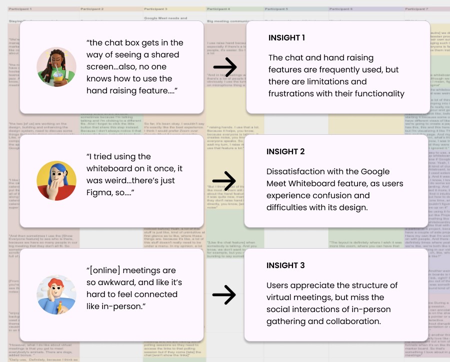
I utilized thematic analysis coding to uncover user insights and drive user-centered design
Thematic coding sorted qualitative user interview data, unveiling patterns for better understanding of needs. It also streamlined data presentation for potential stakeholders, ensuring user-centric design decisions.
USER PERSONA
I crafted an archetype persona to enhance research focus
To make my research more focused and better understand what users need and what problems they face, I created an archetype user persona. This helped me define the problem and make decisions about how to design for the future.

IDEATION WORKSHOP
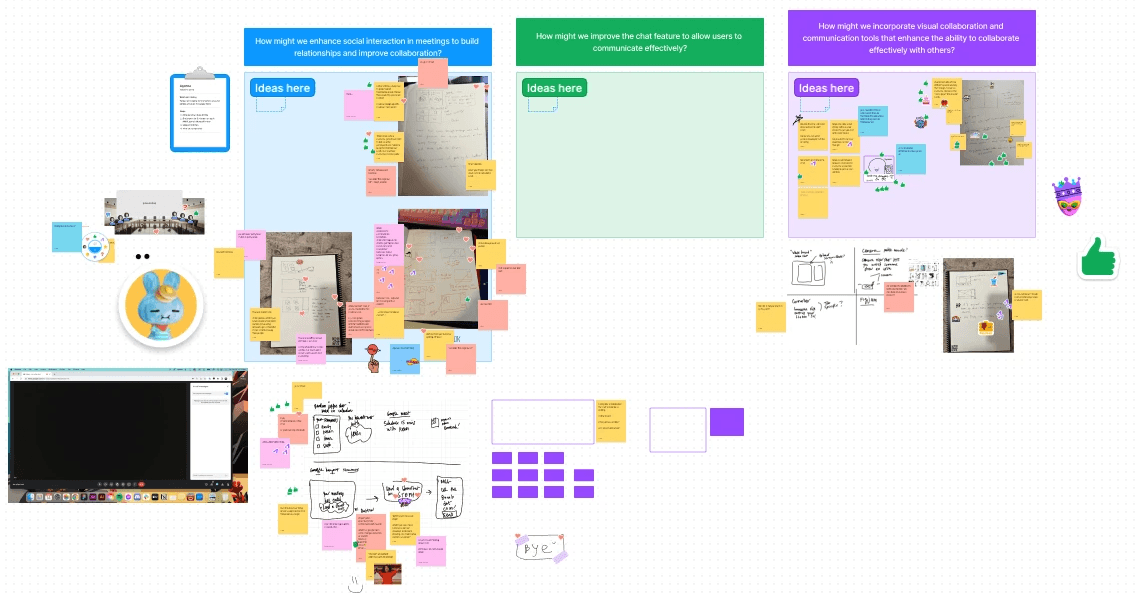
5 minds > 1 - Running an ideation workshop off of HMWs helped to speed up the process and generate solutions
I took the insights from my research and turned them into HMWs. With these questions we were able to do a quick workshop to answer them with as many solutions as possible.
How might we enhance social interaction in virtual meetings to build relationships and improve collaboration?
I decided the solutions generated from this HMW had the most potential to solve most users' pain points. Potential solutions were:
shared notes in the chat during meetings
seeing the agenda and previewing the chat before entering the meeting
INITIAL "SKETHCES"
Quick sketches helped me visualize what the potential solutions would look like
Instead of just using pen and paper to sketch out my ideas I decided to use a sketching software to overlay sketches over screenshots. This allowed me to work much quicker and also better visualize how my solution would look and fit into the existing interface.
THE CHOSEN SOLUTION
Focusing on improving the Greenroom experience was chosen because:
Chance to stand out
Most video conferencing softwares do not have many tools or features in this area before joining a meeting
Won't overload the user
Rather than adding yet another tool in the meeting itself, I felt it was better to update what happens BEFORE a meeting
Solves many pain points
Users complained about feeling anxious before a meeting, or having a meeting but being unclear WHY
LO-FI WIREFRAMES
Quick lo-fis made it clear that I would need to move features around

Offers a feature outside of the actual meeting, reducing potential confusion during the meeting itself.
Too crowded and doesn't fit Google's minimalistic style
Too much information at once, overwhelming the user
Giving users the option to display the new feature would also be needed
Offers flexibility for users to enable or disable the feature based on their meeting needs and privacy preferences.
Maintains consistency with Google's interface, aligning with existing user expectations.
Potential challenges in locating and enabling the feature may impact usability.
Limited adoption and usage may occur if users need to actively choose to enable it.
HI-FI WIREFRAMES
Using Material Design's design system allowed hi-fis to come together quickly
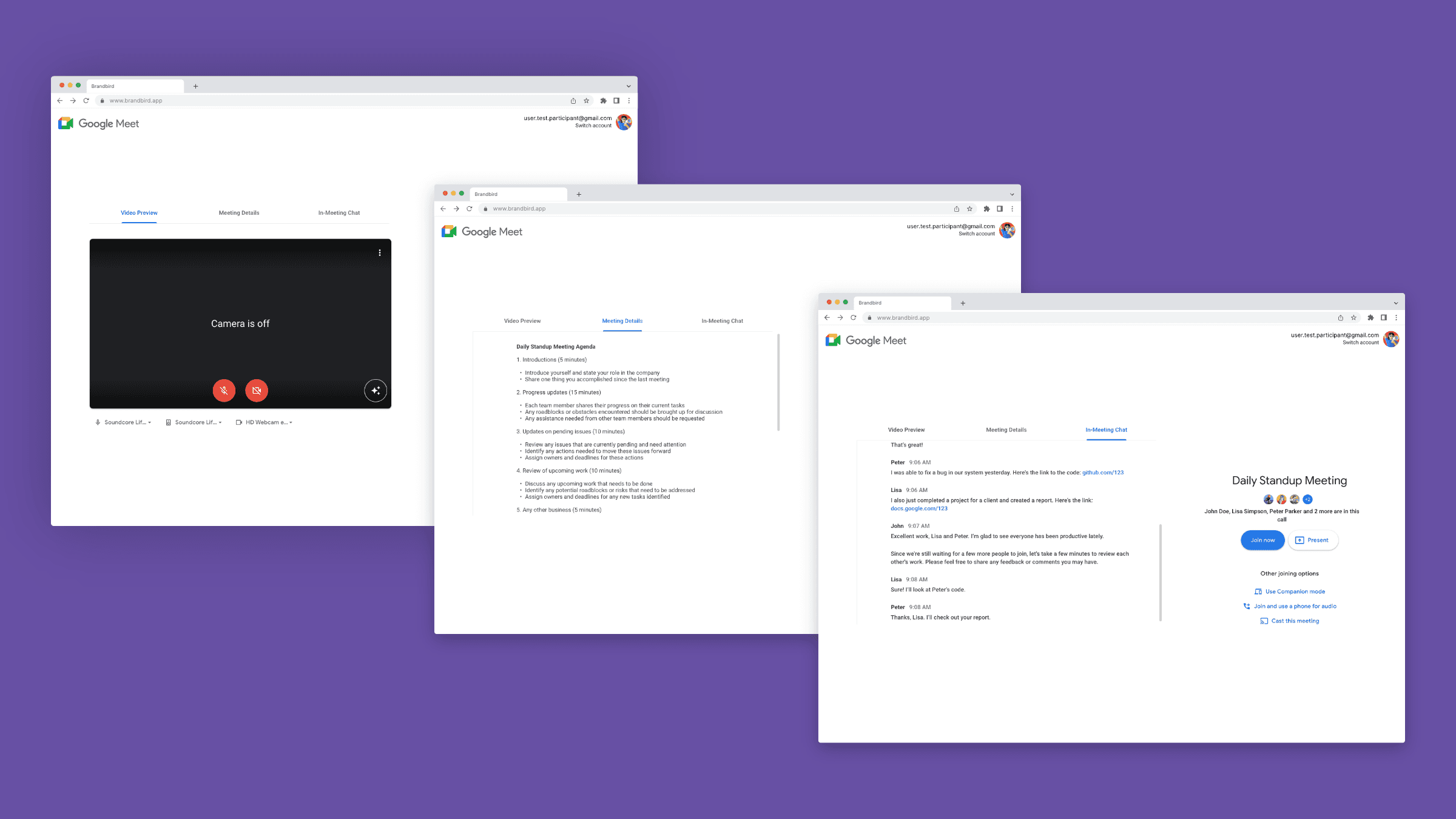
Choosing to add a feature to a Google product certainly had its perks. Since Material Design was readily available, I was about to find components that I could easily "drag & drop" into my designs. The content switcher came handy in keeping the design simple and easy to navigate.
Using a content switcher helped simplify the UI
Version 1
Content switcher to display information

using a content switcher aligned with Google's design system would effectively showcase new features
particularly useful with limited screen space
Might not work
still felt too crowded
design critique feedback suggested to include the video preview within the content switcher
Version 2
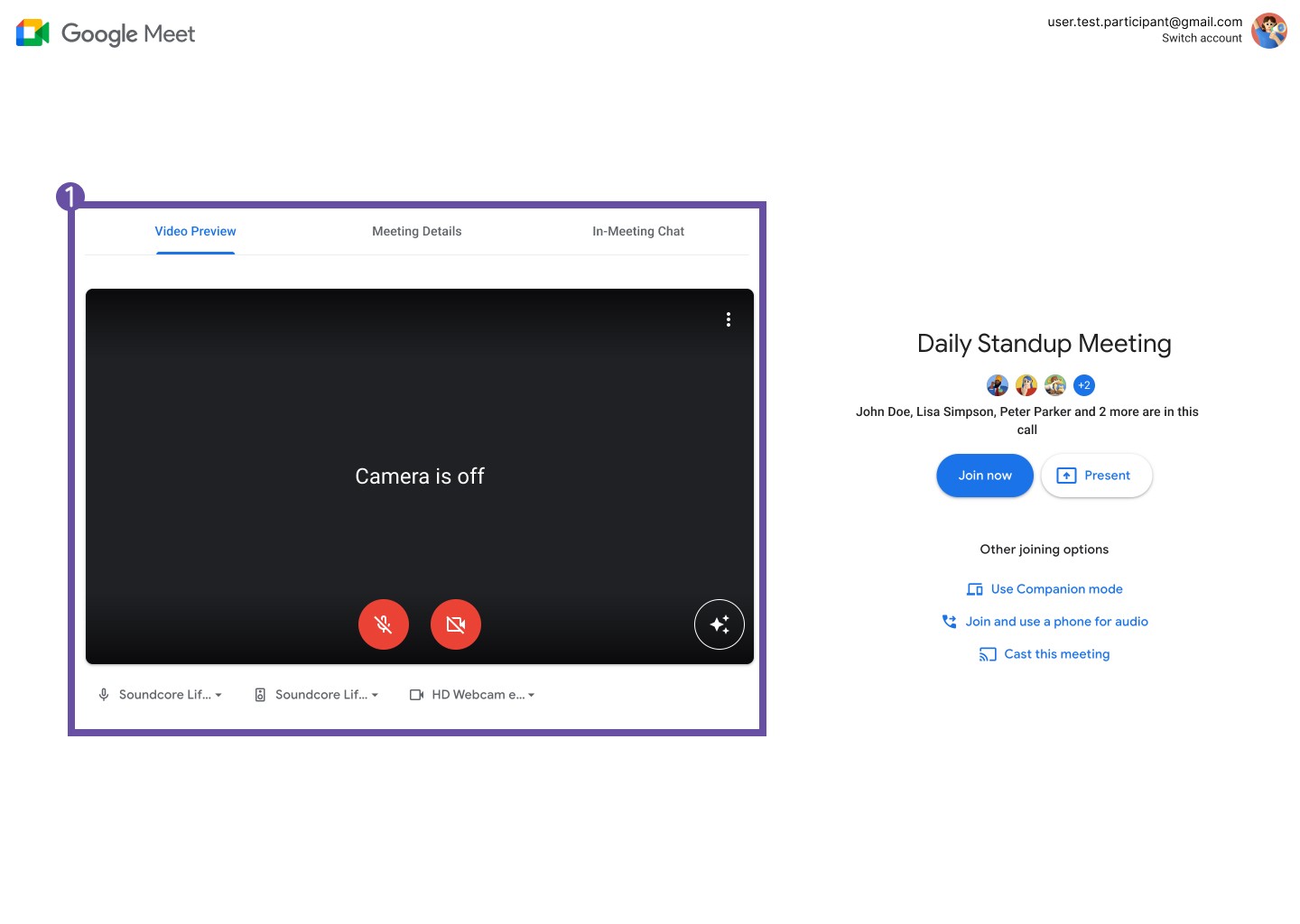
Adding the video preview within the content switcher
greenroom essentially stays the same, now with a content switcher above the video preview
gives users the ability to see the content they want without overloading them
Might not work
Some skepticism on whether or not users understand to click on the other tabs
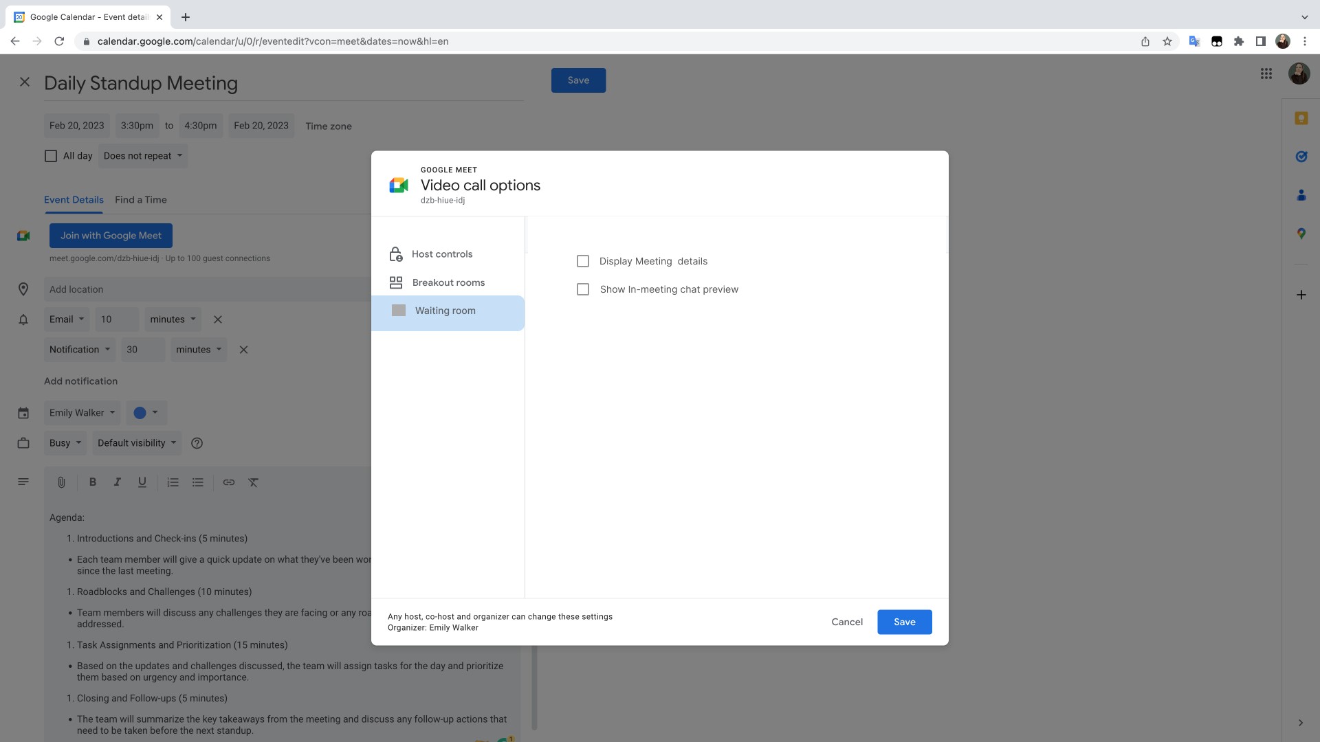
Users can enable the new feature when creating a meeting
Version 1
A separate tab for the new settings adds more clicks

Add a new tab for "waiting room" settings
The meeting host can turn on new feature by checking the box
Might not work
New settings could fit in "host controls", giving the user one less click
check box doesn't fit with existing UI
Version 2
New settings in "Host controls" is easier to find

Put new settings in "host control" for easier access
change check boxes to toggles to fit current UI
Might not work
Overall, the new settings are a bit tucked away and users may not find them. (Spoiler: testing will reveal this)
TESTING
completetion rate
(with little to no assists)
Average usefulness rating
(5= very useful, 1 = not useful)
Average difficulty rating
(5= very easy, 1 = very difficult)


PRIORITY ITERATIONS
Guiding the user to discover and use the new greenroom feature
Taking inspiration from Google's current UI, I utilized one of their banners to indicate to their user that a new feature had been added to the greenroom.
Before

After

FINAL SCREENS
Users can easily switch between video preview, meeting details, and in-meeting chat before entering the meeting

When setting up a new meeting, users will see a pop-up indicating the new feature

Mobile concept screens to show how the new feature could be displayed on a smaller screen size

REFLECTION
Thanks for reaching the end!
Check out more of my projects:
Let's connect!
Send me an email: emily.r.walker@gmail.com
